614 MAGAZINE
2021 - PRESENT
Within a year of launch, 614 has gained recognition and sponsorship and funding from
︎JD Sports
︎Nike
︎Redbull
︎Chivas Regal
︎NSW Australian Arts Council
︎Innkeeper Studios
︎Many independent fashion and cultural brands through advertisements
And media recognition from
︎︎︎ Vice Media
︎︎︎ Life Without Andy
︎︎︎ FBI Radio
︎︎︎ JD Sports
Stocked all over Australia; Sydney, Melbourne, Perth, Brisbane and Canberra.
Founder and Creative Director of 614 Magazine.
Within a year of launch, 614 has gained recognition and sponsorship and funding from
︎JD Sports
︎Nike
︎Redbull
︎Chivas Regal
︎NSW Australian Arts Council
︎Innkeeper Studios
︎Many independent fashion and cultural brands through advertisements
And media recognition from
︎︎︎ Vice Media
︎︎︎ Life Without Andy
︎︎︎ FBI Radio
︎︎︎ JD Sports
Stocked all over Australia; Sydney, Melbourne, Perth, Brisbane and Canberra.
(quite literally everything)
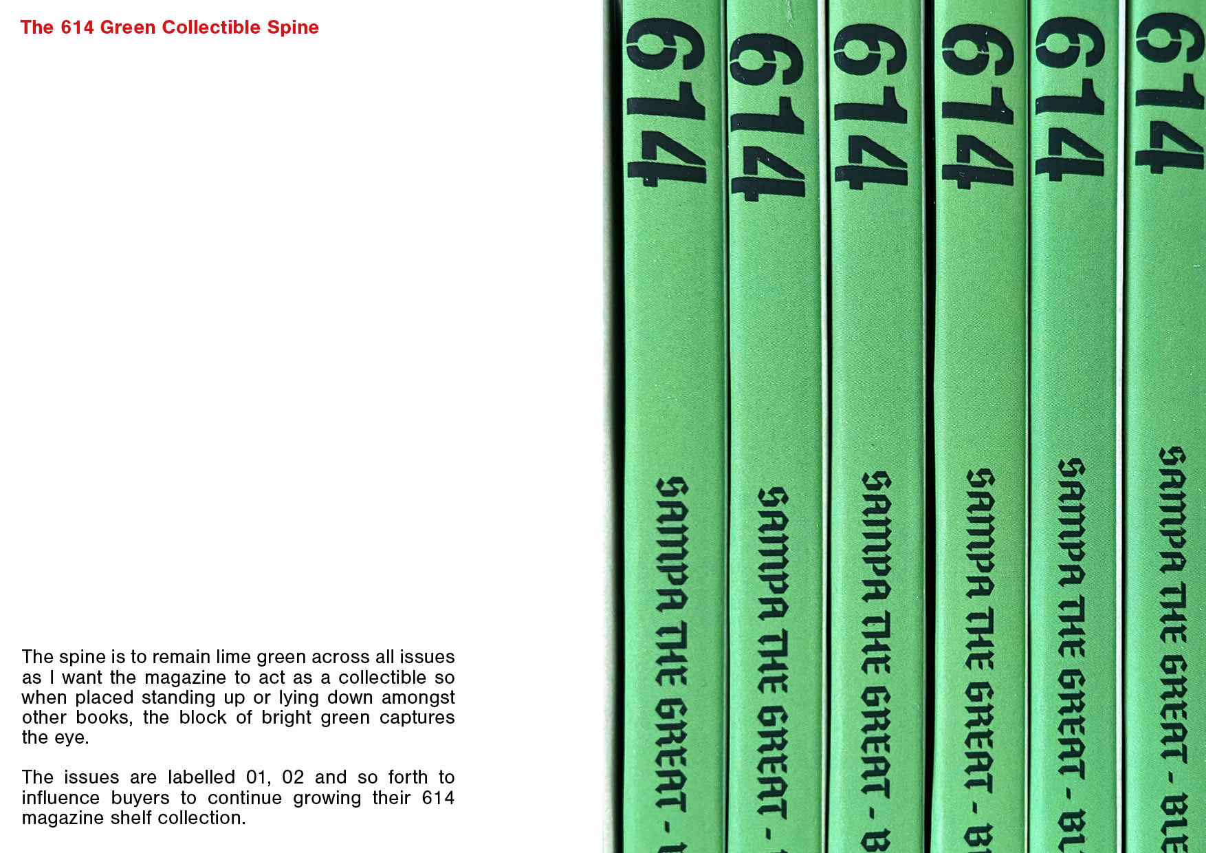
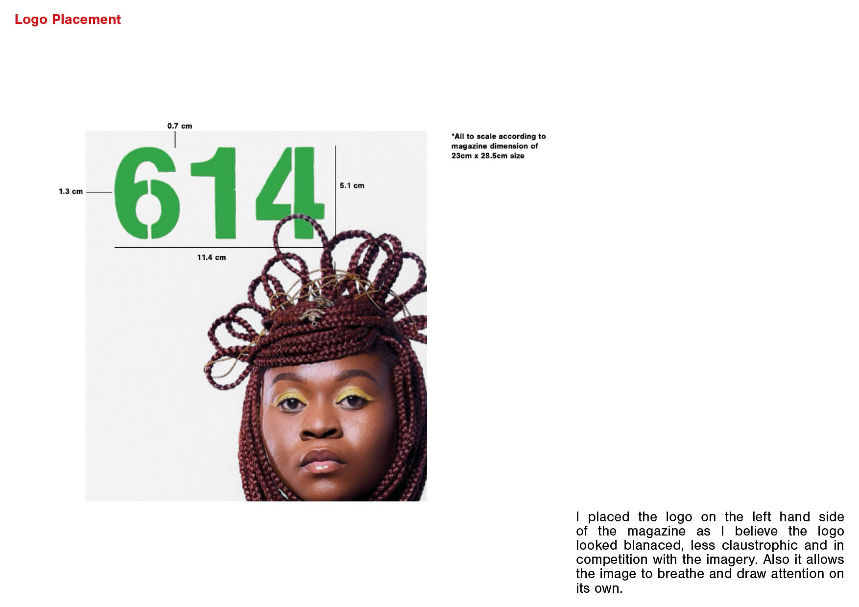
- 614 Branding
- Content Coordinator
- Pitching/Sales
- Project Manager
- Marketing & Social Strategy
- Graphic/Motion Design
- Web Design
- Digital and Print Production
- Experiential Activation and Event Production
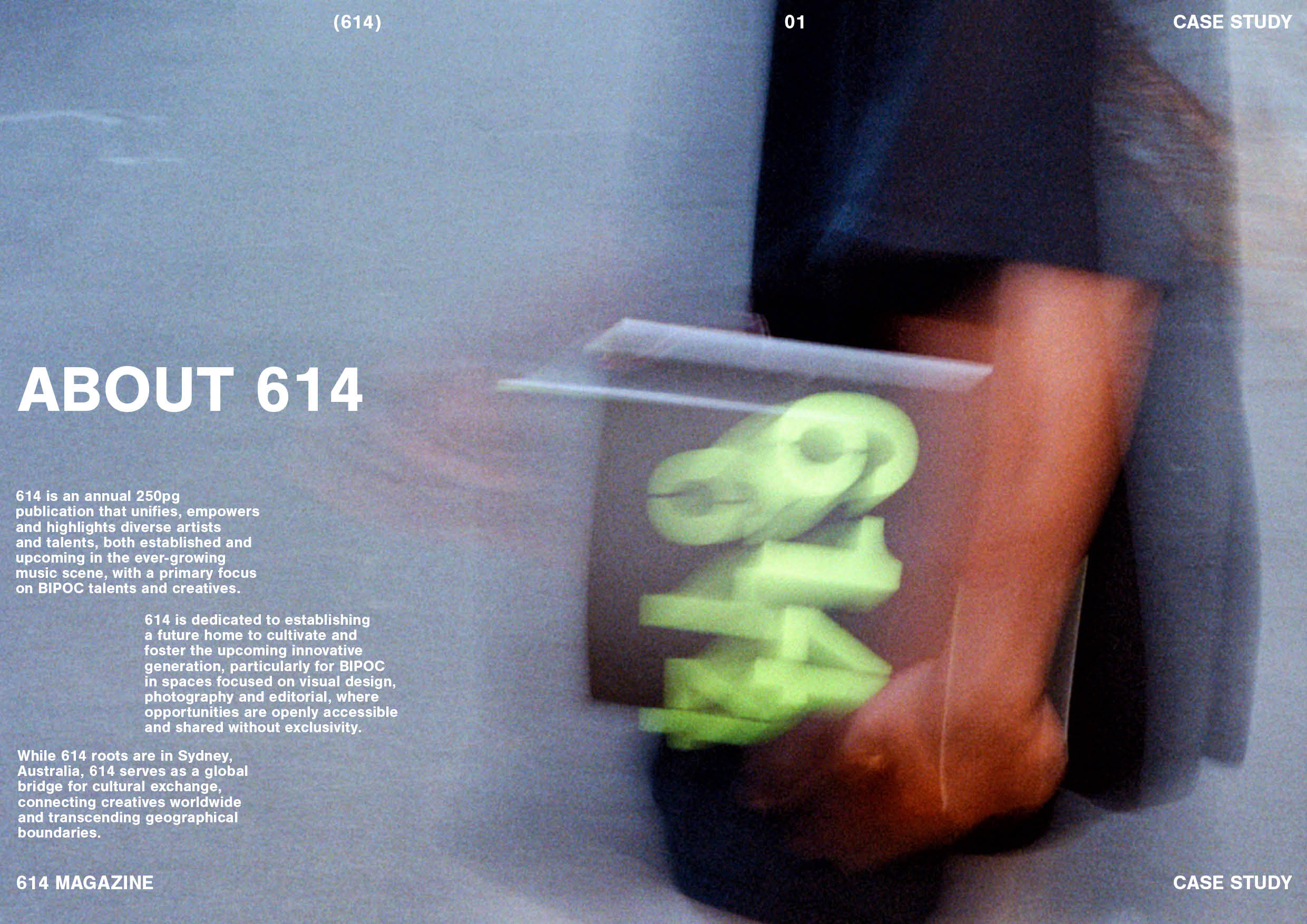
When the world shut during Covid in 2020, I was a fresh graduate from UTS with a Bachelors in Visual Communication.
I decided to utilise my time to start a passion project I’m heavily passionate about; representation of Black, Indigenious and POC in the creative industry.
There was a gap in the Australian market with little to no publications showcasing and empowering our local artists and creatives in the music, fashion and creative scene, so thanks to Covid, 614, was born.
I pitched and co-ordinated across many music labels including Universal Music, Sony, Warner, numerous PR’s and independent management teams.
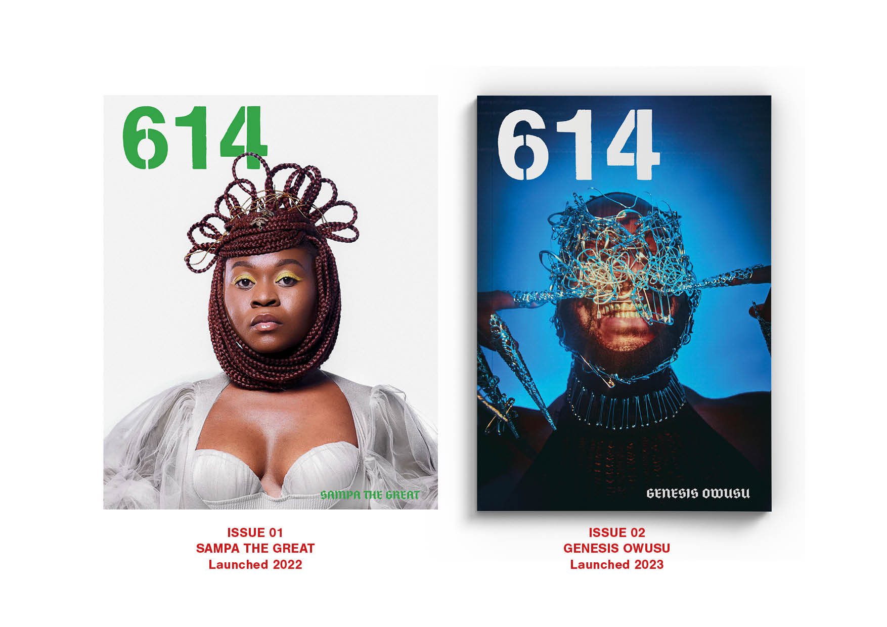
614 Case Study + Design Rationale
Click to zoom
Click to zoom

1.

2.

3.
4.
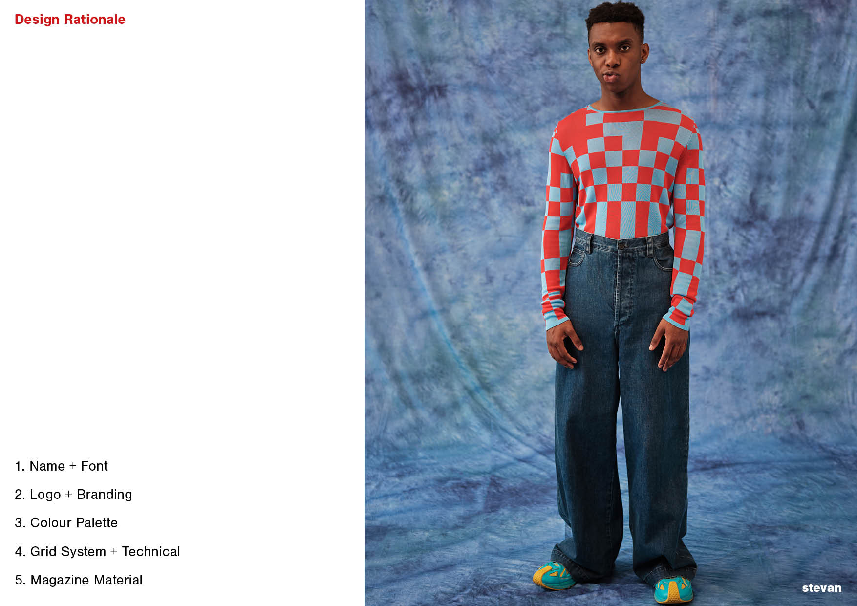


5. Click image to zoom above for Visual Identity & Design Rationale
6.


7. Click image to zoom above for Layout & Grid System
Inserts of Issue 02
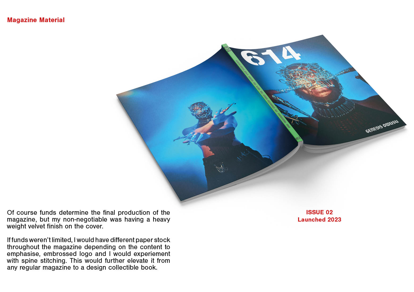
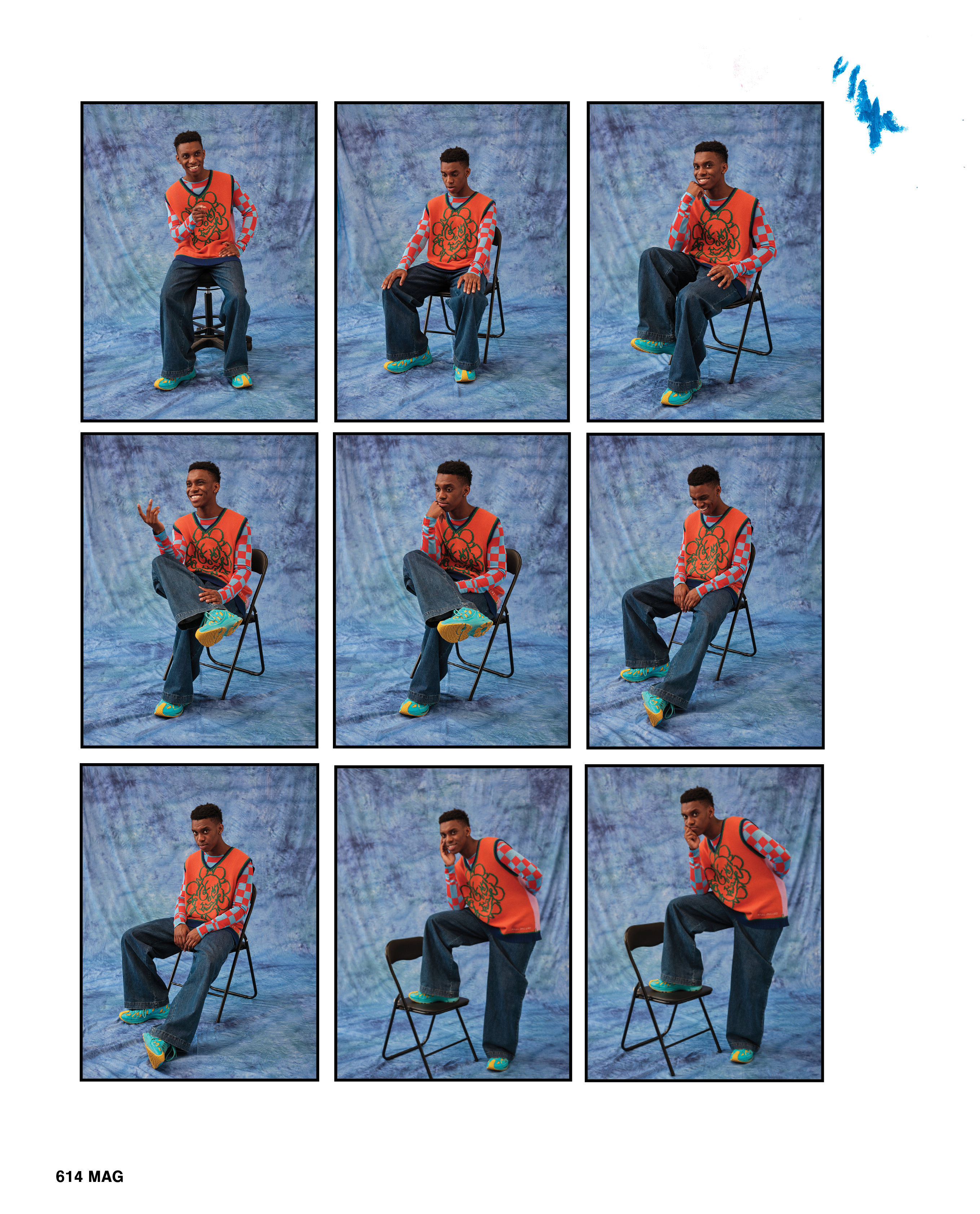
With all issues, I want the images hold most weight of the magazine but of couse design is to lift or help convey a particular feeling or message about the particular content.
With Issue 02 I wanted to be more experimental and playful with the design compared to Issue 01, in regards to layout, imagery, typography, graphic elements and colours. Especially with typography, a lot of the headers were hand generated e.g. Genesis Owusu made with noodles.
*Details about my design thinking on motion graphics will be presented at end of this portfolio.
Going into two examples of two editorials, I art directed each artist’s photos according to their artistry branding, and story. From there I went in to design to help bring it all together.
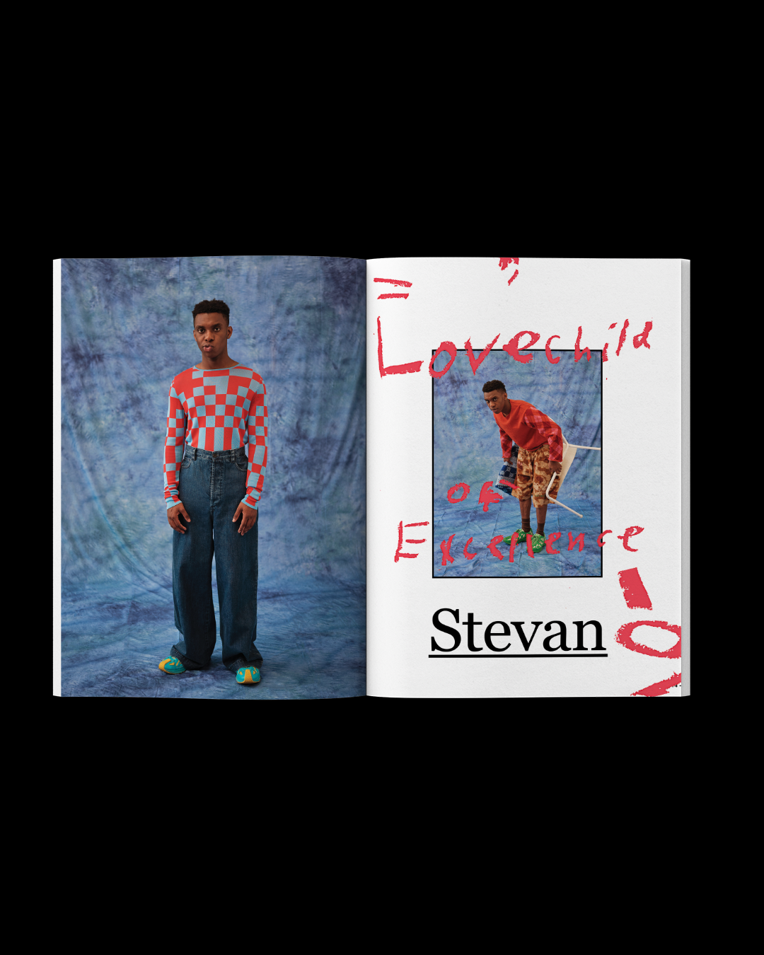

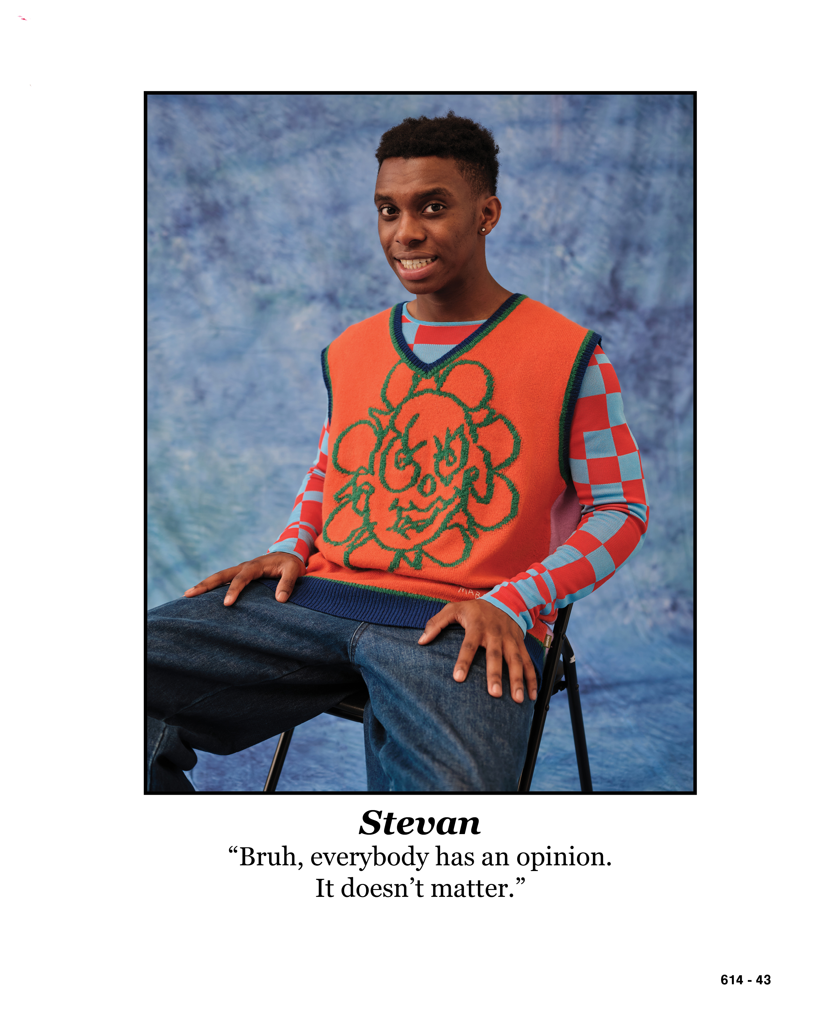
Stevan was a 20 year old who started music in school experiementing with sounds and gained a lot of popularity and recognition from renowned artists and radio stations.
I wanted to capture the essence of youth and school photo days. Design wise; I had my 5 year old cousin write his header “Lovechild of Excellence” and draw some drawings and his accidental marks on the pages. I scanned it in and placed in the background of the pages. The serif font is based off the 90s school books to encapsulate the theme.
I wanted the text to flow in blocks so it’s a bit more playful then just straight columns of text. The images were strategically placed to break up large blocks of text so the viewer is not demotivated to read.


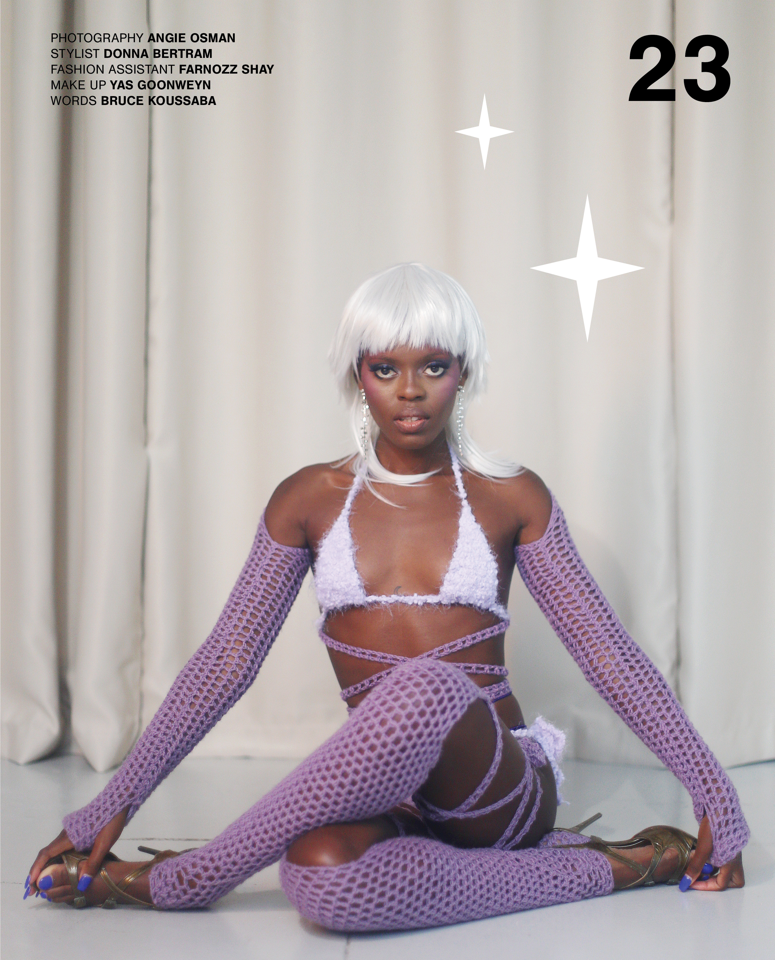
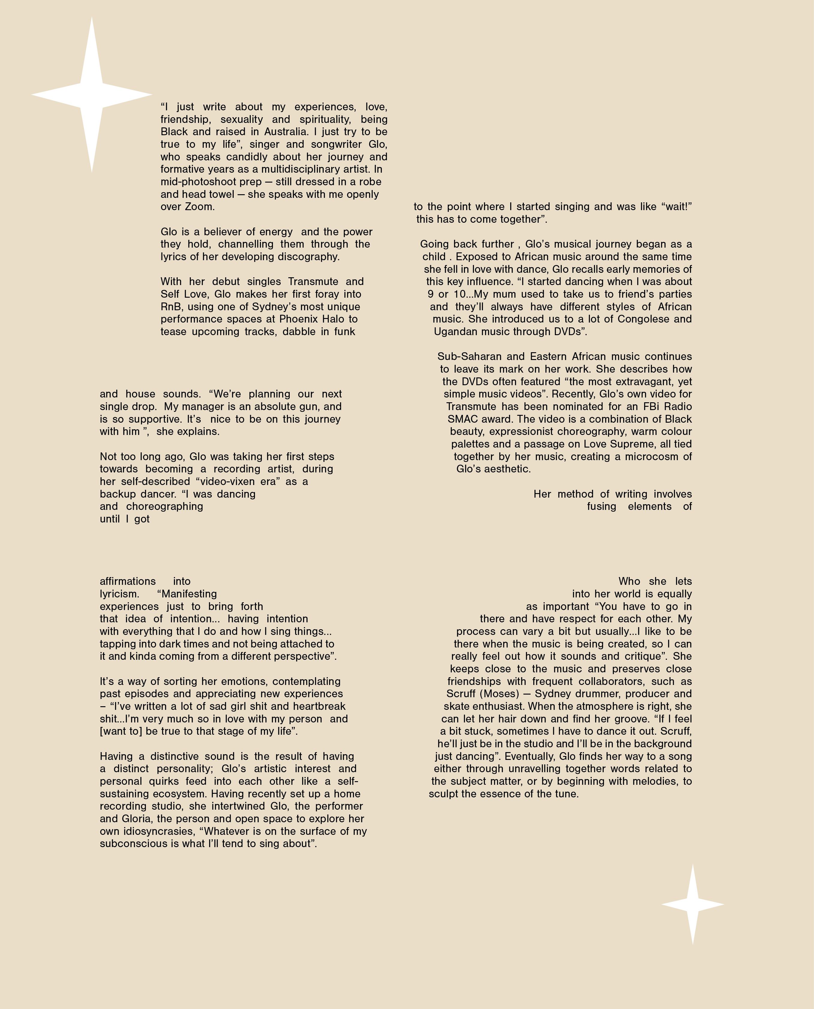
Glo, is an rnb/pop artist and a dancer. She’s a big believer in manifestation and having intentions in everything she does si this was the main design theme for the content.
I wanted to express the fluidty of movement and dance through the layout of the text and quotes. Luca (my assistant graphic designer for this issue) captured it perfectly alongside adding the elements of the stars representing glow, manifestations, and dream.
Creative Strategy
I decided to launch 614 Issue 01 on social media with strong motion graphics. I want to grab as many people’s attention and a static post wasn’t going to be enough to move and spark a sense of curiosity to the viewer.
Note: Static posts were posted beforehand so that there is a content for people to read more about what is coming.
My main objective with motion graphics is getting my message across clearly with strategic minimal words through a quick storyline of graphics and images. However I still like to keep a sense of mystery and get people curious to dig more.
My main message is uniting (the problem) the Aussie creative community (my target audience) through 614 to the world (my brand mission) with Issue 1 or 2 (solution which is the product).
With every motion graphic or launch I always believe in reinstating the problem, mission and the solution which is the product, especially to ignite spark in the viewer. Considering this is an annual magazine, every launch needs to land strongly.
With every motion graphic or launch I always believe in reinstating the problem, mission and the solution which is the product, especially to ignite spark in the viewer. Considering this is an annual magazine, every launch needs to land strongly.
Design Thinking
I love anything that is graphically futuristic e.g. rotating 3D graphic elements, sc-fi glitches etc. It speaks freshness, modernity and avant-garde to me, and this is 614’s visual identity.
The main element of the motion graphics with Issue 01 is the rotating of the logo and the magazine. In 2021, it wasn’t really a big thing to have rotating elements on social assets, so this definitely sparked a lot of people’s interest.
Issue 02
I wanted something fresh and new to give to the viewer to excite them again. So I decided to watercolour the logo and respray paint the logo. I scanned it in and played around with it in after effects; distorting it and adding movement to it.
I loved the look of it, alongside with the VCR/TV glitches, it gave the feeling of something is ‘brewing’ or ‘loading’, which perfectly tied in with the launch of 614 Issue 02.